Interactive maps provide county-level COVID-19 data
Author
Upcoming Events
Related News

Interactive data and tools are helping counties make decisions when it comes to battling the COVID-19 pandemic.
Organizations and universities created tools specifically for counties to provide insight into how the virus is impacting local communities. The following are a few tools that provide county-level breakdowns of data that may be helpful to decision-makers working to combat the spread of COVID-19.
COVID-19 county policies
Researchers at Harvard created an interactive map that shows local policies established related to the coronavirus pandemic. Through the tool, each county is given a policy score. The number correlates with how many policies are in place in the county out of seven main policies used in the tool. The dataset includes more than 2,700 observations of policy data.
The map shows the status of county policies related to event cancellations, school closures, shelter-in place orders, shelter enforcement, testing facilities, public transportation and workplace closures.
Hikma Health, a healthcare nonprofit, organized the dataset which was crowdsourced by Harvard volunteers and other organizations. The map also shows the total number of positive COVID-19 cases in each county as well as the percentage of a county’s population that has had COVID-19 to date.
View the tool here: https://www.hikmahealth.org/map.
Risk level for attending events
A research team at Georgia Tech created the COVID-19 Event Risk Assessment Planning Tool that shows the risk level of attending an event given its size and location at the county level.
The risk level is the estimated chance that an individual who is COVID-19 positive will be at an event. Users can choose to view data for various event sizes ranging from 10 to 10,000 people to see the risk level in each county. The tool assumes that there are 10 times more cases than what is being reported but notes the rate may be lower in areas with higher testing rates. Users can adjust this number from 10 to 5 to see differences in risk levels.
View the tool here: https://covid19risk.biosci.gatech.edu.
Mobility and social distancing
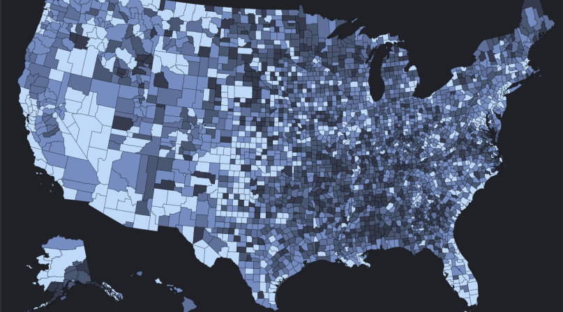
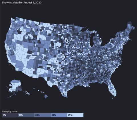
The Maryland Transportation Institute (MTI) at the University of Maryland, in partnership with the Center for Advanced Transportation Technology Laboratory, created an interactive data analytics platform to track the percentage of a county’s population who are staying at home and social distancing.
The platform, which is updated daily, tracks mobility that correlates with outbreak patterns and incorporates data on hotspot monitoring and containment efforts.
Through the tool, each county is given a social distancing index number. Users can view the percent of a county’s population staying at home, the percent of out-of-county and out-of-state trips and the average number of trips taken by an individual each day.
The platform uses MTI metrics, location data from mobile devices and computer algorithms to calculate mobility trends. The tool has been used by various governmental agencies to track trips across the United States, predict future cases, determine reopening timelines and for economic and financial analysis.
View the tool here: https://data.covid.umd.edu.
Cluster surveillance and health factors
A team from the University of Chicago’s Center for Spatial Data Science launched the U.S. COVID-19 Atlas, which provides statistical cluster detection and information on each county’s health profile.
The tool identifies emerging risks based on hotspots and identifies outliers where cases may be high in a specific county, but low in neighboring counties. Users can view each county to see what community health factors and health risks may play a role in COVID-19’s impact.
The COVID-19 Atlas provides a visual to show the spread of the virus from county to county and to track hotspots over time. The map also shows a visual timeline of the spread of the virus each day since January.
View the tool here: https://geodacenter.github.io/covid/map.html.
Risk levels
Harvard’s Global Health Institute and Edmond J. Safra Center for Ethics created metrics that determine how severe the COVID-19 outbreak is in each county.
The Key Metrics for COVID Suppression framework and COVID Risk Level map labels each county as green, yellow, orange or red based on the level of risk for new daily cases.
Counties labeled green are on track for containment and the framework recommends monitoring for viral testing and creating a contact-tracing program. The yellow risk level means there is community spread and recommends rigorous test and tracing programs.
Counties at the orange level are in accelerated spread where stay-at-home orders and/or rigorous test and trace programs are advised. Counties in the red are at the “tipping point” where stay-at-home orders are necessary. The map also includes data on daily new cases per 100,000 people, total cases and total deaths.
View the tool here: https://globalepidemics.org/key-metrics-for-covid-suppression.
Attachments
Related News

Georgia county’s HR policy council goes digital, boosting attendance, reducing grievances
Moving DeKalb County, Ga.’s HR meetings online helped streamline proceedings and boost attendance.

County officials urged to use storytelling to strengthen advocacy, public trust
“People experience these services every day, but they don’t always see the county’s role behind them.”

Rising costs, federal cuts challenge some counties
Some counties across the country are reducing staff to alleviate budget deficits, as a result of rising operational costs and cuts to funding and jobs at the federal level.

